Articles News
Our Growth and Brand Evolution
Exciting updates on our brand from VP of Marketing Stephanie Gunter!
From the start of AS Software to now, we’ve had the same goal
AS Software began its journey in 1991, specializing in “computerized patient record systems” designed to help healthcare administrators and physicians eliminate paper-based processes.
The goal was to provide state-of-the-art, sophisticated technology that allowed our customers to improve the quality of care they provided while enhancing their daily efficiency.
As the digitized healthcare environment grew, the original product was refined and further developed into a more sophisticated, robust solution — always adapting with the needs of our client base.
Everything we build begins with our relationships
AS Software became a leader in ultrasound reporting and image management, thanks to customer relationships guiding the progression of the product.
Organic growth driven by referrals led to additional successes in Women’s Health, directing the company into new General Ultrasound and Vascular sub-specialties, and set us on a course to keep expanding to adjacent markets.
We’ve cultivated our brand naturally, now we want to express it
This year we’re continuing to build our vision for what’s next with our customers by growing our stellar team and investing meaningfully in tools and talent that help us scale.
We want our brand to always reflect the growth and identity we’ve been cultivating since 1991 and showcase a visual identity our team members and customers are proud to represent. That’s why we’re now excited to unveil our renewed visual identity and share how it was created.
We’re taking our presence to the next level
Over months of planning and through a process of internal and external research and interviews, we laid out a foundation for expressing our brand values and unifying theme.

Each new brand element ties into our brand expression as a practical and attentive “benevolent leader”, and brand personality as a supportive and reliable “protector” that helps customers with confidence and responsibility. Our core purple color stems from this identity and symbolizes the wisdom, uniqueness, and stability of our company.

Our new brand palette and logo are also a modern reflection of our purpose, to enable an efficient focus on patient care with technology that instills confidence and feels second nature, for a seamless workflow.

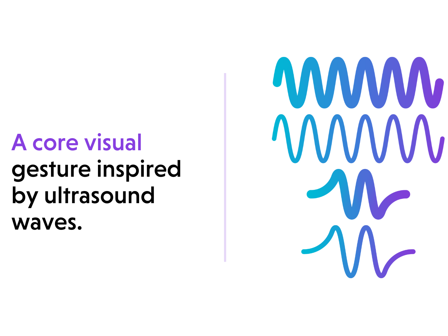
Tying together these elements is our core visual gesture, the wave. Our brand wave is inspired by the sine wave visualization of an ultrasound.

I invite you to explore the new website and follow along with us on our journey as we continue growing to better serve the ultrasound reporting and image management market.
Thank you to the entire Studio Science team and the AS Software Marketing team, who spent many months bringing our new brand to life!